
Compassion Is A Strategy: How Sabrina Carpenter, Potato Chips, and Illustrated Infographics Set One Management Course Apart
Impact Through Empathy: Where Words And Visuals Overlap
Mark Haggarty and I connected over a year ago through a shared belief that when it comes to effective communication, empathy is never beside the point.
Mark is a seriously good communicator. Unlike me, who re-wrote the sentence you just read more times than I can count, he’s a master at finding the right words. His deep understanding of communication and the role it plays in organizational health led him to found Spacebar Projects, where he coaches business leaders through challenging periods of growth and change. And the human generosity that animates his work has also led him to mentor the next generation at Loyola University Chicago's Quinlan School of Business, where his MGMT 201 course teaches the fundamentals of effective team leadership.
While Mark’s work focuses on language and mine on visuals, we realized we’re both driving folks towards the same place: meaningful dialogue that increases a shared pool of understanding.
As Mark prepped for his 2025 fall semester at Loyola University, he decided to give visual storytelling a go. So we started brainstorming ways that an illustrated slide deck could add even more life to his already vibrant lesson.
Lose Your Message, Lose Your People, Lose Your Project
As we kicked off the project, Mark ran me through a foundational lesson in his MGMT 201 course.
In Communicating To Completion, Mark makes the case for compassion as a strategy. Far from a nice-to-have, emotional intelligence is core to effective leadership. Because when it’s your job to deliver messages and directions with clarity, you’ve got to ensure you’re speaking in a way that folks will hear, understand, and respond to.
In order to keep folks motivated and moving in the right direction, leaders must first take the time to understand what drives them, what their needs are, and how they can make their team feel their work actually matters. By speaking in a way that centers the team rather than then themselves, leaders can ensure their message is heard, can engender a culture of trust that allows for honest conversations, and can build a team’s resilience to deliver even under stressful conditions.
On the other hand, when leaders lack emotional intelligence and treat folks as tools rather than people, their message might be rebuffed, teams might rupture, and the projects they are paid to deliver might fall apart.
To sum it up bluntly: If you lose your message, you lose your people. And if you lose your people, you lose control of your project.
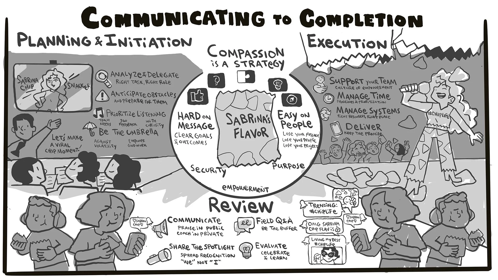
It’s Not A Construction Site, It’s A Sabrina Carpenter Potato Chip!
Mark and I searched for a visual that would hit home with his students. My first sketch couched his lesson in a construction metaphor, with leaders as foremen and teammates as skilled operators of complex equipment. While it fit the content, it didn’t feel quite right to Mark on a narrative level, who couldn’t imagine his students getting excited about cranes and steamrollers.
Ever attentive to the attention of his audience, Mark knew that pop stars resonate with undergrad students a lot more than power tools.
So he pitched a much better idea: A Sabrina Carpenter potato chip brand activation.
Practicing what he preached, Mark found a narrative that met his students’ interests, would gain and maintain their attention, and be meaningful to them on a personal level, as brand activations are a project a student could legitimately go on to lead after graduation. Each section of the visual would describe the role of emotional intelligence throughout the project lifecycle of the theoretical brand activation (which turned out to tap into a fast food zeitgeist neither of us had been aware of).
I ran with it and built out an infographic that transformed Mark’s tenets of compassionate communication into an irresistible snack of an illustration.
Making The Message Stick Through Illustrated Infographics
When the infographic was complete, we transformed it into three deliverables, each with a unique communicative purpose.
The first was the full infographic, ready for digital use and formatted as a printable handout.
The second was a slide deck, which Mark could click through to visually anchor the narrative of his lesson.
And the third was a redacted handout with only the header text in place, giving students the chance to take their own notes and capture what mattered most to them during the lesson.
When Mark and I huddled up after his class to debrief, he told me that the visual “allowed me to use what we created together in a way that the message hit home...there was a lot more stickiness to it.”
It meant a lot to hear that from someone who makes messages stick for a living.
Ready For More Creative Presentation Design?
If you want to bring your presentation to life with engaging, hand-illustrated infographics, let’s talk.