
Looking Good: Visual Thinking For UX Researchers
Why Design Matters
As a visual strategist and graphic facilitator, I’m fascinated by the impact design has on our personal and professional lives.
While some folks in the business world think of design as decorative, nothing could be further from the truth. Visual design shapes, defines, and influences our lives on a nearly constant basis.
That crosstown subway transfer you barely caught? Thank Google’s design team for transforming a tangled maze of tunnels into a simple set of brightly colored pathways.
Your new favorite binge show? There’s a reason that Netflix invested so heavily in both an algorithm and a menu layout that helped you find it.
When done right, visual design is the concrete expression of countless decisions made to help you navigate the world. It’s strategy made tangible, and it’s a crucial tool to help you guide customers through experiences that benefit both their needs and your bottom line.
That’s because customers work with, buy from, and interact with companies and brands that give them a positive, easy-to-navigate experience.
Today, as our world shifts increasingly towards online spaces, design has become even more of a driving force in the economy. That’s because nearly every customer and stakeholder interaction—from the WFH worlds of Zoom and Slack, to the e-commerce malls of Amazon and Etsy—are now mediated by highly designed digital experiences.
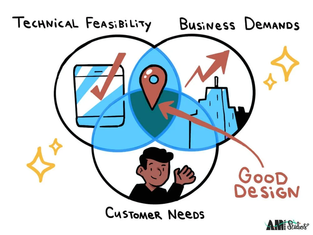
But designing a user experience that meets at the golden intersection of business demands, technical feasibility, and user needs is tricky.
It needs to guide customers intuitively towards their goals. It needs to build brand trust and loyalty through enjoyable interactions. It needs to look damn good.
To put it bluntly, it needs to help your customer spend their time, attention, or money on you and feel good about doing it.
Oh, and it should do all those things so seamlessly that your customer barely notices they’re happening.
Sound like a lot to juggle?
UX Research: Your Ticket To Design That Works
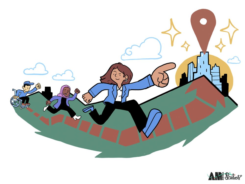
User experience research (often shortened to UXR) is one of the first steps towards a successful product design—one that makes both your customer and your CFO happy. Through UX, researchers identify ways to use design to make the world a more joyful, intuitive place for their user base. UX research often starts with an observed pain point in daily experience that a new or existing product can correct (“Hey you know what bites? How long it takes to hail a taxi… What if there was an app for that?”).
Through the UXR process, researchers then gather data on what real people need in a given application or digital product, study how they interact with prototypes, and gather data to help them make design decisions based on reality rather than assumptions.
The end result? A user experience that builds trust, keeps users coming back, and leads to those oh-so-coveted customer conversions.
Overcoming UX Research Challenges, With Visual Thinking
At it’s heart, UXR is about designing with real people at the center of every decision. In the Venn diagram of business drivers, technical feasibility, and customer needs, it’s the third that UX research seeks to better understand.
And, as anyone who’s ever, well, met another human being will know, what drives human behavior is… kind of complicated. We think as much with our hearts as our heads, and that means that UXR needs to gather not only quantitative data (what percentage of people like a green button rather than a blue button), but to grasp and make sense of qualitative data as well (why they prefer green in the first place).
UX researchers seek to understand not only the practical needs of their user base, but their emotional needs as well. That means investigating their subjects as whole humans, not as abstract data points.
And that can be hard to do, especially at a meaningful scale.
UX researchers face a host of challenges when gathering and evaluating qualitative insights. They need to identify a set of target users that is specific to their purpose, but that isn’t exclusionary. They need to build safe spaces for honest conversation, and to avoid opinion echo chambers or imbalanced dialogue. They need to organize and analyze findings in order to transform them into design recommendations. And then, after all of this, they need to convince executive stakeholders that their recommendations—which may run counter to initial assumptions—are worth implementing.
Visual thinking, which utilizes design thinking tools such as graphic facilitation and strategic illustration to enhance collaboration, improve communication, and clarify complex ideas, can be a powerful tool in overcoming some of these UX research challenges.
It can lead to better diary studies, more successful focus groups, more engaged co-design sessions, and more buy-in from your c-suite stakeholders.
Here’s how.
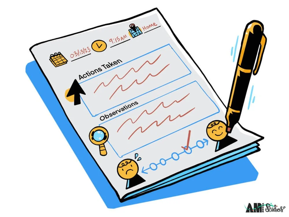
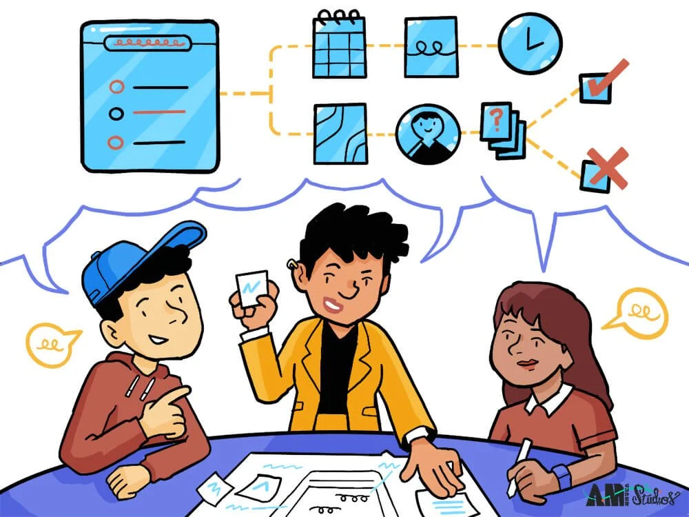
UXR Tip 1: Draw A Better Diary Study, With Illustrated Journal Templates
Diary studies give UX researchers a glimpse into how users interact with a digital product or platform over the course of time, and help them understand how the product is used in the wild. Users are invited to keep a log of their interactions with the app, allowing researchers a better grasp of key motivations, pain points, and their context in daily life.
But diary studies can become a challenge when participants log their experiences in wildly varying manners, when they are unsure of what kind of data to log, or when it begins to feel like too much of a burden and is dropped altogether by participants.
Illustrated journal templates can help to regularize the way participants log their experiences, reduce the sense of burden they might feel, and result in a more uniform set of data for researchers to examine.
What does that look like in reality? You might try…
Adding pre-defined prompt questions to a physical or digital journal, with an icon attached to each
Adding an emotional scale or heat map, to allow users to plot how they feel about an application throughout the course of the day
Including a color code for various functions to help your UXR team easily identify which segment of an application is being addressed
It’s like that deluge of data turned into an easy river of insights, overnight.
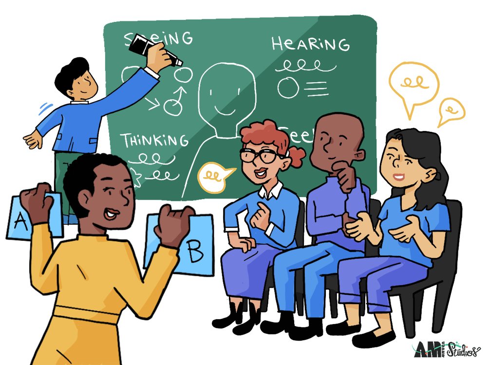
UXR Tip 2: Use Graphic Facilitation For More Focused Focus Groups
Let’s talk about one of the more controversial UX research methods: focus groups.
Focus groups have a complicated reputation in the world of UX research, and for good reason. At their best, they have the potential to unearth meaningful insights. Focus group dialogue has the potential to spark new ideas, and to unlock memories or perspectives that may have laid dormant in one-on-one interviews.
But as the Nielsen Norman group points out, while focus groups are a powerful way to uncover user needs, they can also derail into opinion echo-chambers, become dominated by a single voice, or spin into tangents.
So how do you get all those good qualitative insights out of a focus group, while navigating their potential pitfalls?
Graphic facilitation is a powerful way to organize conversation, equalize voices, and spark meaningful dialogue. If you’ve never seen graphic facilitation in action, it’s the practice of synthesizing dialogue into illustrated notes in real time in order to increase engagement, unlock creativity, and guide discussion in a fruitful direction (imagine white-boarding or mind-mapping on steroids).
A skilled graphic facilitator will work closely with a moderator as they synthesize and visualize conversation in real time, making participants feel heard and valued, encouraging balanced discussion, and tracking varying perspectives in an unbiased manner.
By literally showing your focus group that you’re listening to them, graphic facilitators engender trust that leads to more open and sincere contributions. Equally important, they provide a structure to navigate otherwise unwieldy topics, and to address and de-escalate any tensions that may arise from divergent perspectives.
By the session’s end, graphic facilitation leaves a record of the conversation that can immediately be analyzed and applied to the next design round.
Pro Tip!
Pre-drawn visual templates like empathy maps and user journey maps can help facilitators to keep conversations focused and ensure that key research questions are addressed. Your graphic facilitator can fill in the sections as you go, giving both your research team and your participants a picture of what’s been covered and where to move the conversation next.
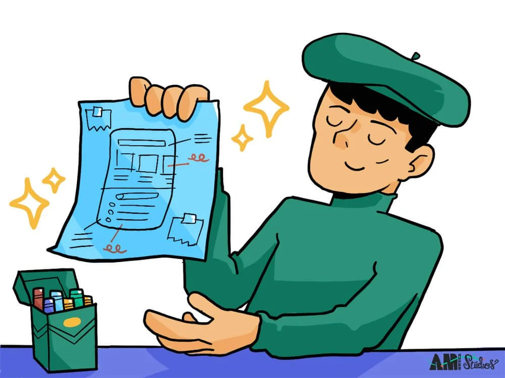
Tip 3: Co-Design With Hand-Sketched Wireframes
In its ideal state, the UX research process is a way of turning real users into collaborative partners in the design of a product. So why not treat them like a part of the design team?
Asking participants to sketch out key functions of your product or platform can uncover some incredible insights into their needs and goals. That’s because drawing helps people to think more creatively, more clearly, and with more of a sense of play than simply verbalizing or writing.
Invite your focus group to sketch out the key functions they’d like to see in a particular area of a product, or to collage together elements from their favorite related app or website. Just be sure to have them walk you through their sketches, as well!
Pro Tip!
It’s easy for participants to freeze up when asked to provide feedback on a visual mockup, especially if they don’t consider themselves “artists.”When sharing a mockup with your co-design group for review and feedback, consider sharing it at a low-fidelity level.
Your participants will feel more comfortable sharing critical feedback and suggesting their own alternative solutions when presented with a sketch rather than a fully-resolved, high-fidelity mockup.
UXR Tip 4: Build Buy-In & Gain Budget, With Strategic Illustrations
Collecting and analyzing user needs is only the first step. Next, it’s time to bring the c-suite on board.
Even after you synthesize your findings into actionable recommendations for design improvements, UX researchers need a way to share those recommendations in a way that builds buy-in and opens purse strings. Easier said than done when vying for executive attention, especially if the research uncovered insights that contradicted initial assumptions or beliefs about user needs.
Unfortunately, while convincing decision-makers to act on findings is obviously a crucial step in the UXR process, it’s also oftentimes overlooked until the last minute.
Strategic illustration, which synthesizes complex data into visual stories, can help overcome this final challenge. Illustrated user personas, customer journey maps, and infographics transform UXR insights into clear and compelling narratives that can help move a decision-maker’s needle from “maybe” to “go for it.”
In other words, strategic illustration has the power to turn your audience into your advocates. That’s because, beyond showcasing UXR design recommendations, strategic illustration helps stakeholders to imagine the bright future that lies ahead when those recommendations become reality. And when they become invested on an emotional level, investing on a fiscal level suddenly feels a lot more feasible.
Ready To Make The Most Of Your Next UX Research Session?
Get in touch today for a free consultation, and learn how graphic facilitation and strategic illustration can help your team make design decisions that matter.
Learn more about UX research with these great articles:
“10 Most Used UX Research Methods in 2022,” for Medium, by Vincent Xia
“6 User Research Methods And When To Use Them,” for DesignLab, by Maria Myre
“How To Conduct User Experience Research Like A Professional,” for CareerFoundry, by Raven Veal
“The Use and Misuse of Focus Groups,” for Nielsen Norman Group, by Jakob Nielsen